Concept B
Would You Dare
At times, asking someone to take action doesn't necessitate a reason, especially for minor requests. This concept prompts users to practice wellbeing before explaining 'why,' through dares.
With use, users will naturally come to appreciate the benefits of daily wellness acts.

By taking these small steps and unlocking prizes, Kat not only cultivates courage but also nurtures her well-being.
Would You Dare: Storyboard

Kat, a new college student, feels distressed by struggling to adapt to the environment and make friends.
Turning to the "Would you dare" app, Kat set goals
and encounters relevant prompts for self-care actions. These include activities like calling a friend, or ordering favorite food.

Would you dare to...
bask in sunlight for 10 minutes?
1.3 Research Section Summary


Relying on users to log their data daily, the app loses effectiv-eness in the absence of consistent input.
Absence of a system to track genuine behavior change.
The daily tasks being repetitive increases the likelihood of them becoming tedious.
1
2
3
Artifact analysis: existing daily-wellness apps


Research
1
1.2.1 Insight I
One cause is the difficulty in prioritizing health without experiencing pain firsthand. Students might also have trouble recognizing mild symptoms that could worsen into serious health problems without timely attention.
This underscores the importance of "early intervention," potentially preceding users' acquisition of sufficient wellness knowledge to comprehend its significance.
Health issues are neglected until consequences arise.
Student interview quotes

“I did not realize that I need to practice self-care until I had a breakdown...”
— A junior student
“Career and academia is more important than health and happiness!”
— A freshmen student
1.2.2 Insight II
Community health and individual well-being are intertwined.
Our open-ended survey unveiled that numerous students aspire transformation of campus culture rather than specific services (such as workshops on xyz).
Peers have immense impact on one another.

Student responses on one of our installations
1.2.2 Insight III
Drawing from both primary and secondary research, the following issues emerge as common challenges experienced by students:
While acknowledging shared perspectives, it's crucial to embrace individual distinctions. Each person harbors unique health goals. For example, I might target improved sleep, while a peer concentrates on adopting healthier eating habits. Thus, accommodating individual goals stands as a pivotal element
in our offered services.
While shared issues are prevalent, students have personal issues and goals.

Stress

Sleep

Depression

Loneliness

Dietary

Lack Exercise

Strand eyes
Mental
Physical
1.2.2 Insight IV
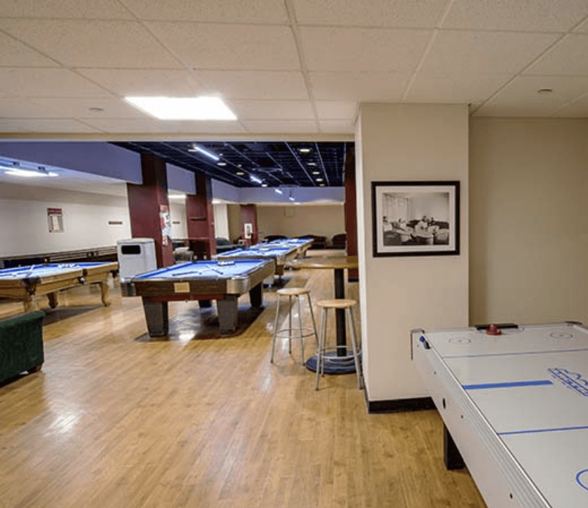
On-campus resources are targeted but scattered.
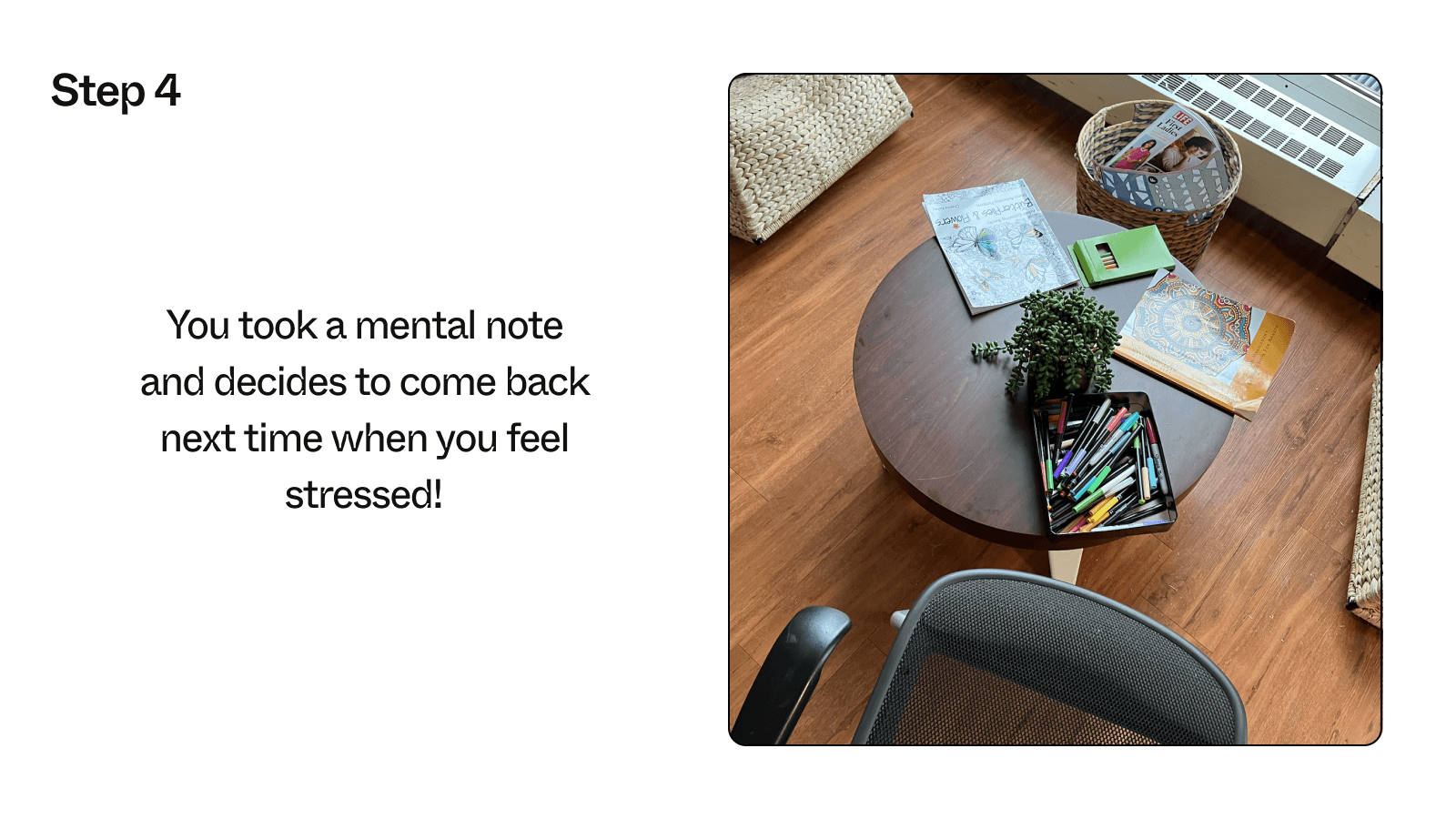
Visiting the meditation space // Mindfulness petting event // Game room


1.2.2 Insight V
Many wellness apps follow a pattern where users log their mood and behaviors (via text/img entries or checking off checkboxes), with the app serving as a record to visualize changes. Nevertheless, this approach faces the subsequent challenges:
Off-campus solutions track behavior but
lack action promotion.
Furthermore, in universities’ competitive environment, students prioritize academics and social activities, leaving little room for well-being. Some students wrongly assume that parents prioritize short-term career and academic achievements; yet, parents prioritize their children's health above all.
Our design should encompass a broader range of stakeholders. While the service primarily targets students, it should not be confined to their exclusive use.
Mapping points of synergy and oppositions among core stakeholders

Qualitative data further reinforces the idea that within campus environment, students' values and behaviors influence one another, leading to a decreasing emphasis on health. Accordingly, our design endeavors to use social connections to foster a
positive atmosphere.
Note: This is not a formal Qualitative study. These data analyses were collected alongside quantitative data collection, primarily to help validate/challenge existing insights.
Findings
As students spend more time at CMU, their exercise and sleep decrease.
Those taking more credits tend to workout more. → Exercising seems to be a mindset/ attitude!
Students often match their friends'
exercise frequency.

~100 responses

Analysis
Based on guerrilla research and interviews with university staff, we now know...
These discussions sparked an idea: our design could fuse existing resources, serving as a centralized platform to access, promote, and share the school's services.

The information about health resources during Orientation often gets ignored due to the busy schedule... and we don't talk about them much after that.”
— An Academic Advisor

I don't think a broad base of students are aware of the full array of resources that we have.”
— University Health Promote Director
2.3 Early Concepts and feedbacks

Proceeding to concrete from and UX flow ideation with consideration of research
and LXD frameworks


2.4 Iterating, Testing, Refining
Synthesizing user feedback


2
Ideation

2.1 Concepting Process Overview
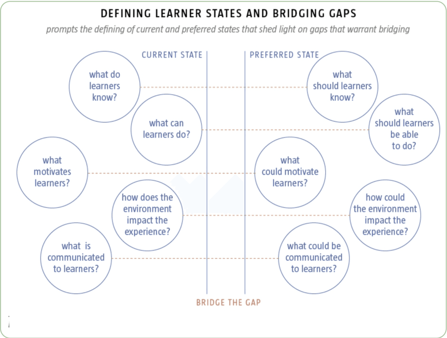
2.2.1 Model I: Learning Gaps
Based on the audience's current (problems) and preferred (goals) state, we identified gaps between the two points that are critical for our product to bridge.
Ideating with the Learning Gaps Model
Bridging the Gap
Current State
Preferred State
Students are unwilling to spend time and effort on self-care.
Wellness doesn’t cause a lot of time and energy.
Teach in
bite-size
Use gamification tp cancel-out tediousness
Find topics that students resonate with
Scattered resources; hard to navigate
Effortless navigation and access
Mobile-first,
well designed resources guide
AI powered
chat bot
Only show students the resources that are relevant to them
Wellness is a solo journey,
Supportive, informed community
Higher visibility of how/what peers are doing
Cultivate new social connections
Learning Gaps Model
Julie Dirksen, Design for how people learn
2.2.2 Model II: Learning Styles Model (4MAT system)
The most efficient mode of learning varies for each individual. Effective at-scale learning experience design often guides learners through cycles of understanding the 'why,' 'what,' 'how,' and 'what if' (Bernice Mccarthy 1970), ensuring that all students can learn effectively regardless of their personal preferences.
We use the 4MAT system to categorize current wellness resources into quadrants and focus ideation on less-explored ones.
4MAT System
Bernice McCarthy, About Learning

Ideating with the
Learning Gaps Model

2.2.3 Model III: Practice—Feedback Model
The psychology and pedagogy realm has substantiated the idea that mastery is born from repeated practice. This assertion underscores the effectiveness of recurring practice spread over time compared to singular educational instances.
However, the inevitability of daily routine can lead to monotony. In response, we took Motivation model into account and focused on ideating ways to infuse variability into this seemingly tedious daily task to retain users.

2.2 Ideating with LXD Models

Sketching Frameworks
Ideating with the Practice— Feedback
and the Motivation Model
Cycle of practice and feedback
Susan Ambrose et.al, How Learning Works
Motivation Model
Susan Ambrose et.al, How Learning Works


How might we encourage practice
Type of skill we aim to teach
Providing targeted feedback

User feedback
Positives

Concerns

User feedback
Positives
Concerns

User feedback
Positives

Concerns

Concept A
Scotty Land
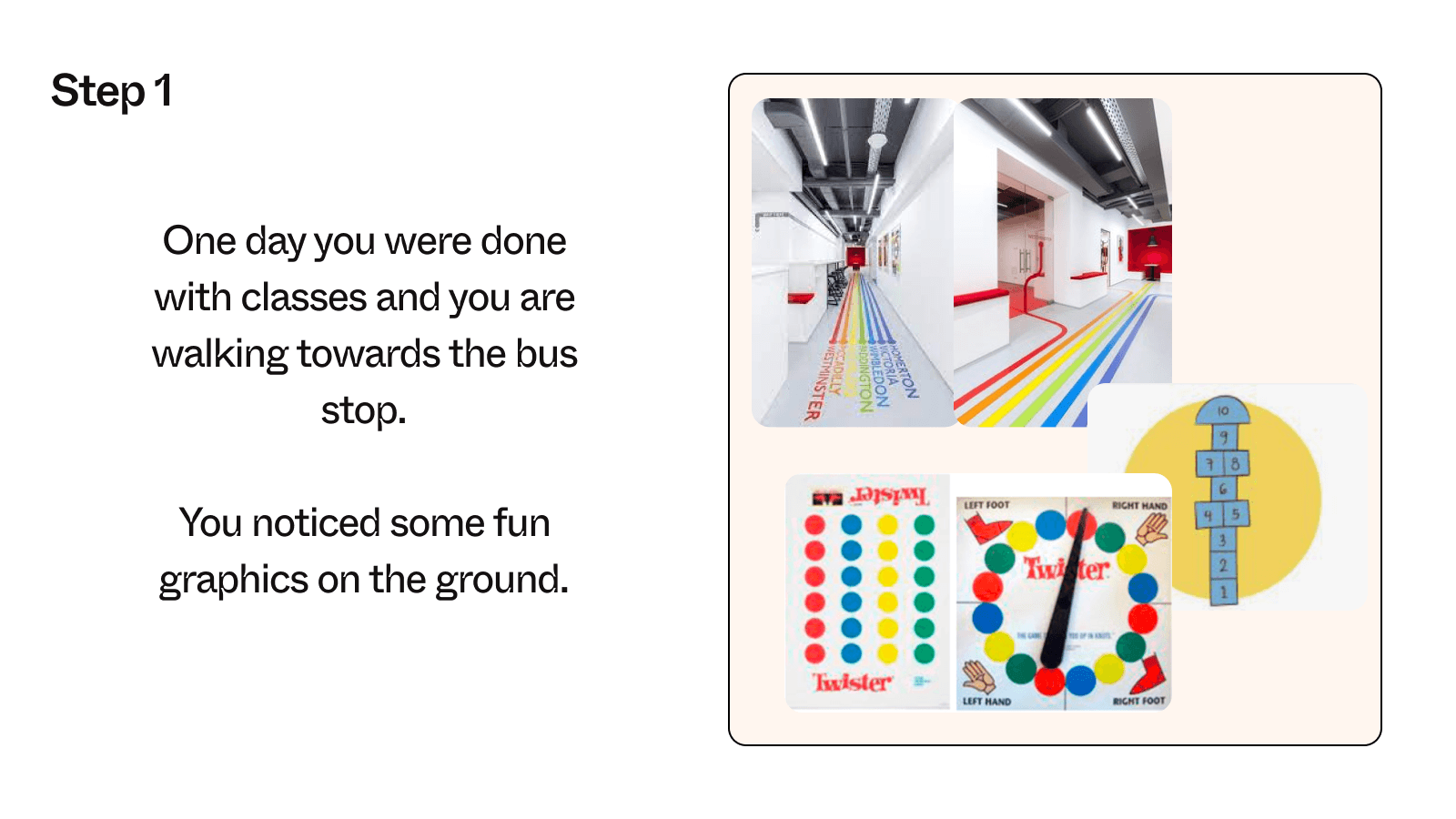
Use physical installations to create a playful setting, leading learners to on-campus resources while imparting bite-size wellness knowledge en route.
The intentionally 'effortful' exploration, coupled with surprises, captures attention, making learning rewarding and enjoyable.
Scotty Land: Storyboard



Conducting Speed-dating
3
Concept Refinement

3.2 Micro Interactions
3.2.1 Example: Form of Peer-to-peer Interaction
3.1.1 Our LXD Framework
In the 4MAT model discussed in the previous ideation section, a typical learning experience usually begins by communicating the significance of the topic to be learned and then the action to be taken. In the context of wellness, according to research, students often understand the importance due to the detailed research but still don't take action. Our 'practice before knowledge’ UX approach would help bridge the gap.
But how did we encourage users to practice a little every day?
3.1.2 The Training-wheel Approach
You might wonder if users can use it long-term (over a year).
We frame of Daily Nudges as 'training wheels' for seeking health. The initial design purpose of this app is to make users realize the significance of health, the benefits of daily wellness, and to learn some bite-sized exercises. So, our aim is for users to achieve a certain level of mastery, allowing them to care for themselves and community wellness in absence of nudging.

3.1 Final Concept
User testing session

real
world
time
synthetic world
Theme 1
Apply
Apply
Explain
Learners can feel,
hence Interpret benefit of
daily wellness acts
Explain
...
...
...
Theme 2
Theme 3
Nudging
Nudging
Daily Nudges’ framework
As depicted in the diagram below, the concept urges users to engage in daily wellness practices through both real-world and synthetic approaches. After some time using the app, users naturally feel the positive impacts of these daily actions, motivating them to continue using Daily Nudges to practice more wellness topics.
The app currently addresses seven wellness topics, which were identified as the most common health concerns among the CMU student community during the research phase.

We designed the daily commitment to be brief.
low time commitment
1

During onboarding, we assist users in setting their own short and longer-term goals, providing them with daily motivation using the Structured Flow of Goals Model (Julie Dirksen, Design for how people learn).
power of goals
2

gamified experience
3
We opted to gamify the process of daily prompts. Students can choose their favorites to execute, similar to selecting rewards. Users also collect daily prompts by completing them as if gathering collectable items.

community effort
4
Real-world friends help keep each other's progress on track. Just as with 'BeReal,' when the majority of a group engages in an trend, individuals are more likely to participate.

reflection of self
5
Following the principles of the Magic Circle Model we've introduced a virtual wellness assistant, Daisy, that reflects the self within the synthetic world. Daisy encourages users and fills the gap when social connections are unavailable.
Multiple rounds of Think-aloud Protocol helped us determine how (and how much) peers should interact via the app.
Eventually, we opted for users to challenge each other, share their completed well-being activities with friends, and optionally add a message. Alternatively, users could independently complete daily challenges.

In later versions, we experimented with indirect interactions, like earning props or giving gifts to friends through daily challenges. However, this needed refinement to effectively foster peer-to-peer engagement.
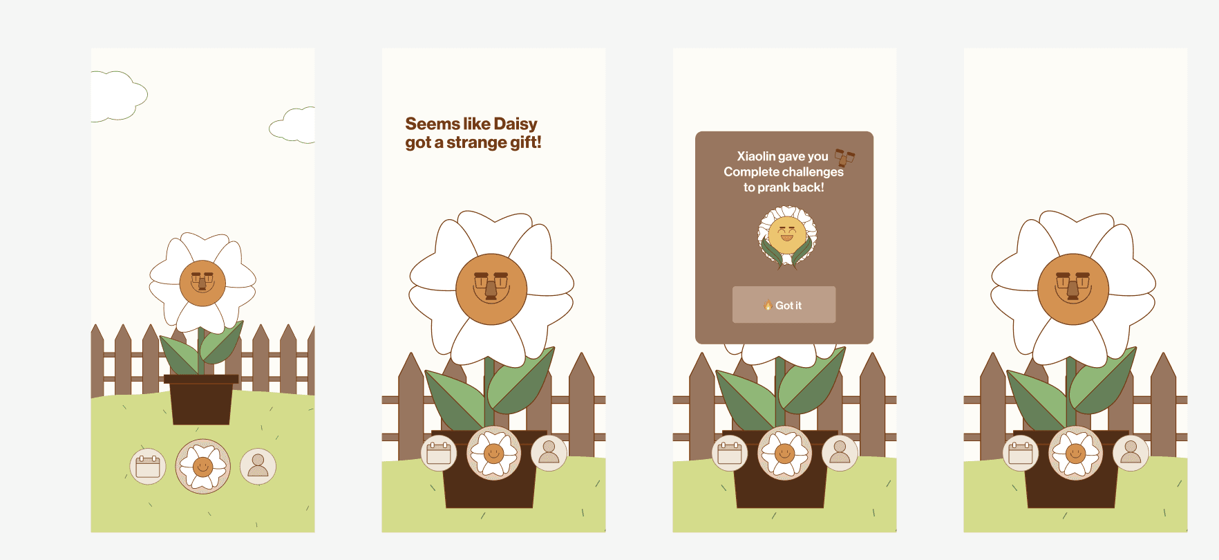
Initially, we mandated users to post after practicing well-being acts to unlock messages from friends. But this approach needed to be more inclusive. What if a user faced sensitive issues or preferred not to post on certain days?


4.1.2 Typography
Daisy (the assistant) feels like a smart, caring friend, which is what
I need as a wellness companion.
— User feedback from a moderated testing session
Deliver
4
Branding and Next steps
4.1.1 Lo-fi screens

Onboarding: setting a goal, selecting exercises and connecting friends
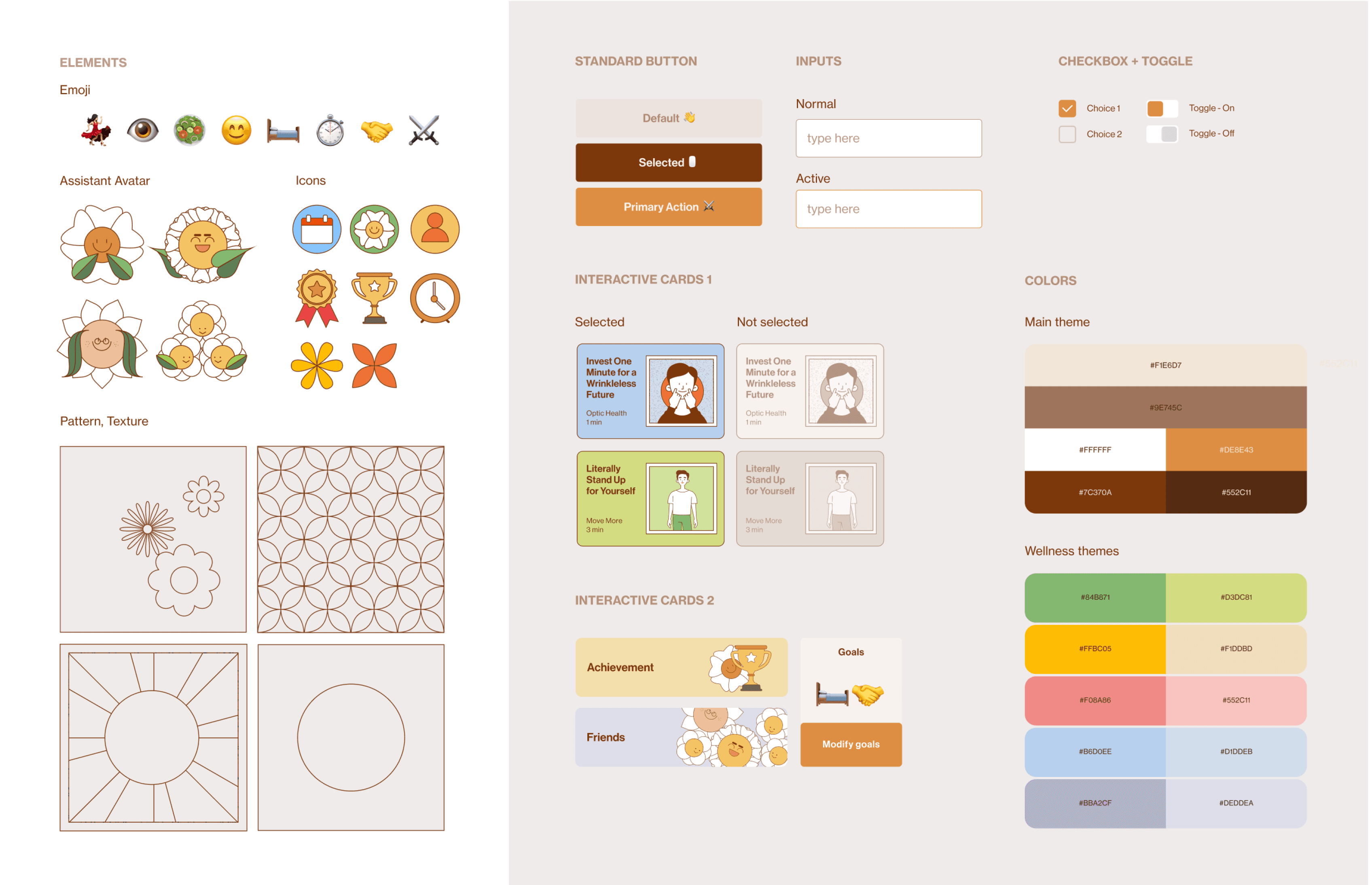
4.1.3 Elements


Users’ rating of the app on semantic differential scales
post changing the copy (which is pretty ideal :)
Generic category names → Wording that relates more to college students

Our writing was initially generic, but we made it more youthful to connect with college students better. However, we were concerned that the playful tone might not suit the serious nature of
well-being topics.
To gauge users' emotions and perceptions after trying out our app, we ask learners to rate our app on four semantic differential scales. The results were ideal! Learners reported a casual, caring, and soothing experience.
4.1 Visual System

Concept C
Daily Nudges
A personalized health assistant, regularly reminding users to take care of themselves and upcoming wellness events.
Daily Nudges: Storyboard


User Journey map
pre-use
Action
Touch points
Feeling/ thoughts
Awareness
phase 1
phase 2
phase 3
phase 4
~2 week
Try and Explore
~12 weeks
Repeated Practice
post-use
Gained Mastery


People:
Peers
Phone (In-App):
Daisy


People:
Peers, Family
Phone (In-App):
Daisy
People:
Peers
Environment:
Campus, Media
Some of my friends are using this. Hmm, I’ll give it a try."
This is fun and won’t take much time anyway!
I can feel I am making progress! I look forward to seeing new prompts, and improving with
my friends.
I'll take good care of my wellness in my future life!


1.1 Domain, Audience & Research Overview

1.2 Insights and Design Implications

Burden
their parents
in any ways
Negative
peer
influences
Easy access to accurate well-being knowledge
Do well in studies and build social relationships
Students
Limited communication with their kids
Healthy, happy kids
Parents
CMU
Healthy, caring school community
Underuti-
lization of resources
Concerns
Points of oppositions
Aspirations
Key points of oppositions among core stakeholders
Existing resources:
Scattered, effortful to reach
College Students:
Enclosed self
Counseling
Mindfulness
Room
Personal gym
coaching
UHS
...
...
Concept model:
Student wellness in college environment
4.2 Tone of Writing

Incorporate non-visual elements like soothing sounds and haptic feedback. This enriches user experience, establishes stronger connections, and reinforces positive behaviors for holistic well-being advancement.
Multi-sensory integration
Enable users to share gained perspectives from prompts. This promotes learning from diverse viewpoints
and prevents repetition of provided information,
bolstering engagement.
Sharing learning outcome
Enhance engagement through personalized social interactions. Customize prompts, group formation, adaptive feedback, gamification, and personalized communication for a collaborative and motivating learning atmosphere.
More personalized interaction
4.3 Moving Forward